Sunday, March 25, 2012

Final Brochure


(INSIDE)

I made the inside of my brochure into a menu. That is why I changed the background color from burgundy to white. It made the text easier to read. Also, I decided to have a flame going across the background to make it look more appealing. I decided to have the type the same as the one I used for my slogan, to make the lettering uniform. However, I changed the size and border colors of the text to make it clear what was the name of the dishes and what was the description of them. I researched each of the dishes to make sure that my description and pricing was accurate. Also, I placed double-sided pitch forks to create a border for the picture of the dishes and to tie into the overall theme. I placed one for each section and displayed a variety of cuisine.
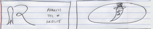

(OUTSIDE)

I changed the background slightly. I flipped the direction of the flame horizontally to make it look like the fire was connected by the corner fold. Also, I made the other side of the background burgundy because it looked better aesthetically than a white background. I placed a picture of a belly dancer in the top left corner and described the Risque experience beneath it using the same type and colors from the menu. Also, at the bottom I placed contact information regarding our Facebook and Twitter addresses. On the next fold, I blew up the chili pepper guy from my logo and placed him across the top. Then I placed my slogan and website information beneath the chili pepper. I placed the slogan here to break up and guide the viewer's eyes down to the bottom of the page. This is where I placed the hours of operation information. The first page of my brochure features my logo on the top. However, I decided to place it inside of a black oval because it made it stand out compared to the rest of the information inside of the brochure. This is important because I want the first thing the reader to look at to be my logo. Then I used pitch forks to break enclose and break up the main photograph of the Flame section of the restaurant. Finally, I placed the physical address and telephone number so that viewers would be able to easily find the information to make reservations and find Risque.

Tuesday, March 20, 2012

Final Letterhead


I placed my logo across the top of the letterhead. I then evenly spaced two large black forks along the side of the page to frame the text that would be placed inside of it. The fork on the right-side runs further down because I wanted to make the forks nearly touch the fire that runs along the bottom of the letterhead. Also, it enhances the aesthetics of the letterhead. Along the bottom inside of the fire I evenly spaced out the address, website and phone number and separated each by inserting the chili pepper from my logo. I had to increase the kerning and angle of the website to make it align better with the rest of the contact information along the bottom.

Friday, March 16, 2012

Final Business Card


I chose to divide the front of the card with a dark yellow fire. I then placed the logo on the left-hand side and changed the color of the fork from black to silver to make it stand out against the black background. I chose to use Washington D Regular font because it worked cohesively with the Bossanova MVB font I used for the lettering in the logo.


For the backside of the business card I used the same color for the background as I used for the fire on the front. I decided to place the slogan in black font with a red border to make the words stand out from the background. Also, I decided to put them resting on top of the double-sided black fork because the design ties in with the logo's fork as well as the devilish, hot theme. I then centered and placed the website in black underneath the slogan because it balances out the space between the top and bottom of the card to the center of the double-sided fork. I also aligned and added contact information pertaining to Facebook and twitter at the bottom right-hand corner. All of the lettering on the backside is written in Washington D Regular font for cohesive purposes.

Tuesday, March 13, 2012

Business Card Sketches


I wanted to have fire dividing the front of the card diagonally with the Risque logo on one side and the company address and telephone number on other. The logo would stay the same, but the fork would change color to silver. The address and telephone number would be written in black to contrast with the yellowish fire. The backside would have a giant black, double-sided fork running across the middle with the Risque tagline on the top in burgundy and the website in burgundy along the bottom. Finally, the chili pepper would be blown up and placed to the right of the fork.


The front would only include the "R" part of the logo and the colors would remain the same. The address, telephone number and website would be written along the right-side in black and the entire background would be yellowish. The back would show the chili pepper from the logo encircled by a burgundy colored oval. The entire background of the back would be black.


I would place my name, position, personal telephone number and email along the left-side of the front of the card in black. I would put the Risque logo going down the right-side of the front vertically. Also, the background of the front would be an off-green. The backside would have a giant black, fork running across the middle with the Risque tagline on the top in burgundy. Finally, the chili pepper would be blown up and placed to the right of the fork.


There would be a swooping white line to divide the Risque logo on the right-side of the front of the card. The background color for that side would be yellowish. The other side of the front of the card would feature the restaurant's hours, address and telephone number in burgundy. The background color for that side would be black. The back would feature the chili pepper from the logo positioned in the center and blown up. The background of the back would be black. At the bottom, the website would be written in black and a yellowish stripe would run along the base.


The front of the card would feature the Risque logo on the left-side and the restaurant address and telephone number in burgundy on the right-side in burgundy as well. The logo and restaurant information would have grey smoke coming off them and the background color would be black. The backside would have a giant black, double-sided fork running across the middle with the Risque tagline on the top in burgundy and the website in burgundy along the bottom.

Thursday, March 1, 2012

Corporate Identity Questionnaire

1) What is your business?
We are a spicy cuisine restaurant, serving dishes from Mexico, Thailand and India in the greater Tampa area.

2) Describe your business in one sentence.
We serve the hottest cuisine in Tampa for those looking to explore their adventurous side.

3) Who is your target audience?
Business professionals, ages 21-50.

4) Who are your competitors?
Our competitors are Thai Island and Taj Indian Cuisine.

5) What makes them better/worse than your product/service?
Thai Island does not have a company website. The restaurant is extremely small and not very upscale. Taj Indian Cuisine’s website does not offer many pictures of the exterior and interior of the restaurant and lots of the components of the website are under construction. Also, it is situated on E. Fowler Ave., which isn’t a great location.

6) Do you currently have an identity?
No.

7) (If your answer to #6 is no, skip this question) What do you like about it and what don’t you like about it?
N/A.

8) How do you want your image to be seen in two years?
We want this company to be seen as a restaurant that not only offers delicious, spicy cuisine unlike any other place locally, but provides a unique dining experience unlike any other fancy restaurant in the greater Tampa region.

9) If your company was an animal, what animal would it be and why?
If my company was an animal it would be a lion because the experience is fierce and exciting.

10) If your company/brand was a person, who would it be and why?
If my company was a person it would be Angelina Jolie because she is hot, risqué and intriguing.

11) If your company/brand was an object, what would it be?
If my company was an object it would be a pair of long heeled, red bottomed Christian Louboutin stilettos.

12) If your customer was a cartoon character, who would it be?
If my customer was a cartoon character it would be Betty Boop because she is sexual and stylish.